When text turns bold on hover, it gets wider and pushes everything after it. This paper measures how much, counts how few web fonts ship the axis designed to prevent it, compares four ways of holding the width with real fonts, and tests our own library on the hard cases, including a bug it had.
Disclosure: the authors make hoverBoldly and other type tools for the web, have built websites for type foundries for over fifteen years, and are building Typetin, a storefront platform for independent foundries (not yet launched). Measurements use open tools (HarfBuzz, fontTools, Chromium); no recommendation requires our library.
Summary
Across 15 popular Google Fonts variable families, going from weight 400 to 700 widened typical navigation labels by a median of 4.8% (range −0.5% to +9.4%, 105 measurements): 2 to 9 px per label at 16 px.
Type design has an axis for exactly this: grade changes stroke weight without changing width. In Roboto Flex, the full grade range changed our labels' widths by 0 px. But of the 544 variable families on Google Fonts with a weight axis, 5 have grade. 96 have a width axis, and narrowing with it also holds the width. Measured letter-spacing holds it too, but looks visibly tighter than either.
So the order we recommend is: grade if the font has it; the width axis if it doesn't; measured spacing if it has neither. For navigation labels, a CSS hidden-copy trick is often simpler still.
The problem
Navigation bars, tabs, filter chips and lists of links often signal hover, focus or the current page with bold. Bold glyphs are wider, so the label grows and pushes everything after it on the line.
Seventeen years of workarounds
The question was asked on Stack Overflow on 17 February 2009 ("Inline elements shifting when made bold on hover"). The first answer, the same morning: "If you cannot set the width, then that means the width will change as the text gets bold. There is no way to avoid this, except by compromises such as…". The question has 251,174 views (read 5 October 2026). A 2011 question on the same problem drew the first letter-spacing swap we found: "most fonts are the same size when you adjust letter spacing by 1px", with letter-spacing: 1px at rest and 0px on hover (Stack Overflow answer, 22 May 2014, question 5687035). It's a rule of thumb, not a measurement. By December 2009, answers to the first question were already setting widths with JavaScript (Stack Overflow).
| Workaround | How it works | Cost |
|---|---|---|
| Hidden bold copy (CSS) | A hidden pseudo-element or grid layer holds a bold copy of the label, so the box is already bold-width (Stack Overflow, 2013; popularised by CSS-Tricks, 2020) | Reserves the bold width at rest, so labels have uneven empty space; not suited to words in running text. Keep the copy out of the accessible name with content: attr(data-label) / "" |
| Fake bold | text-shadow or -webkit-text-stroke thickens strokes | Not the typeface's bold; strokes also grow outward and fill counters |
| Guessed letter-spacing | A hand-tuned negative letter-spacing on hover | Correct for one font, size and label |
| Font choice | Use a family whose bold is nearly width-matched | Work Sans and Roboto grew about 1% on median in our test; a real option when the font is negotiable |
Design systems ship the same trick. Microsoft's Fluent UI tabs have a reserveSelectedTabSpace option, on by default, documented as: "Tab size may change between unselected and selected states. The default scenario is a selected tab has bold text." GitHub's Primer comments its CSS: "renders a visibly hidden "copy" of the label in bold, reserving box space for when label becomes bold on selected". Others avoid the problem by not changing weight at all: in the current source of Shopify Polaris and Atlassian's tabs, the selected state changes colour or adds an underline, and the weight stays the same (our reading of their code, 5 October 2026).
For navigation labels, the hidden-copy trick is a good answer and needs no JavaScript:
.nav a { display: inline-grid; }
.nav a > span, .nav a::after { grid-area: 1 / 1; }
.nav a::after { content: attr(data-label) / ""; font-weight: 700; visibility: hidden; }
.nav a:is(:hover, :focus-visible, [aria-current="page"]) > span { font-weight: 700; }
Measuring the shift
Bold is wider in every family: median +4.8%.
We shaped six navigation labels and a 60-character sentence with HarfBuzz (the shaping engine used by Chrome and Firefox) at 16 px, at weight 400 and 700, in 15 Google Fonts variable families. Median growth was 4.8%; the range was −0.5% to +9.4%. Every family's median widened; one label narrowed slightly (Roboto "Home", −0.5%).
| Family | Median growth | "Documentation" at 400 → 700 |
|---|---|---|
| Work Sans | 1.1% | 120.1 → 121.5 px |
| Roboto | 1.1% | 109.2 → 109.8 px |
| Inter | 4.7% | 114.1 → 119.5 px |
| Montserrat | 4.9% | 127.7 → 132.0 px |
| Roboto Flex | 7.0% | 107.9 → 115.2 px |
| Rubik | 7.7% | 115.5 → 124.3 px |
| Open Sans | 7.7% | 116.1 → 125.0 px |
All 105 measurements are in the data appendix.
Type design solved this first
Fixed widths across styles are old. On the Linotype, a duplexed matrix carried two styles that had to share one width; regular and italic was the usual pair, but, as Craig Eliason put it on Typophile in 2013, "In some cases a bold, rather than an italic, was duplexed with the roman in Linotype matrices." Type designers later gave the idea names:
- Grades. Font Bureau's David Berlow, on Typophile in 2005: "Grades started for me with the development of a Playboy Baskerville… When Poynter began, we had lots of discussions about grades." Grades were for printing conditions, not emphasis.
- Uniwidth. Hrant Papazian, 2004: "I call that 'uniwidth'." Thomas Phinney replied: "It's pretty rare, really. And the bolder the bold weight is, the more divergent the two designs seem." By 2011–2012 members could point to commercial examples, such as FF Balance, whose roman weights all share one width, and the reason sounded like ours: switching weights in a document is useful because "it's nice to not have paragraphs reflow".
- Fixed-offset. Papazian again, in 2013, on making a Light and Bold match: "what I call 'fixed-offset'… Which is where two fonts become uniwidth when a certain tracking value is applied." That is the same idea as measured compensation, applied by the type designer instead of at runtime.
- Superplexed. Recursive (Arrow Type) is built so "every style takes up the exact same horizontal space, across all styles"; "the weight axis does not affect glyph width".
Typophile (2000–2015) is quoted from the archive Simon Cozens and Dave Crossland reconstructed from the Wayback Machine in January 2016 (06b/typophile.github.io, threads 6607, 15204, 77895, 91519 and 100708 in json/); Cozens published a rebuilt version in 2022 (typophile/typophile.github.io).
Phinney's point is the trade-off this paper keeps returning to: the further weight moves, the harder it is to keep width without changing the letters.
Grade: the axis built for this
Grade "alters only the thickness of the letterforms' strokes without changing the width of the glyph" (Google Fonts Knowledge), which notes it was "originally conceived for printed newspapers to calibrate output from different presses". The glossary's entry for the axis goes further: "where accessibility guidelines recommend using a Medium (500) weight for a button label… using a Regular (400) weight with grade +100… will produce the same level of contrast—but without any reflow" (Grade axis). Material Design uses positive grade for "an active icon state" and negative grade for light icons on dark backgrounds (M3). Google's documentation describes it as changing weight "without changing the layout", by "locking the advance widths and kerning" (gf-docs). In Roboto Flex, GRAD from −200 to 150 changed the width of all seven test strings by 0.000 px, at weight 400 and at 700. That confirms the axis does what it is defined to do; how strong an emphasis a given grade range gives is a separate, perceptual question.
Who ships grade
We read the axes of every family in the Google Fonts catalogue metadata on 5 October 2026: 1,950 families, 561 variable, 544 with a weight axis.
| Axis | Families (of 544 with weight) |
|---|---|
Grade (GRAD) | 5: Google Sans, Google Sans Flex, Roboto Flex, Roboto Serif, Signika |
Width (wdth) | 96 |
Signika's grade only runs lighter (−30 to 0). Graded families exist outside Google Fonts, in commercial and newspaper type; this count covers the catalogue most websites draw from.
The width axis
A family with a width axis can hold its regular width by narrowing slightly as it bolds. For each label, we solved for the wdth value at weight 700 that matches the weight-400 width (HarfBuzz, 16 px):
| Family (wdth range) | wdth needed, across six labels |
|---|---|
| Roboto (75–100) | 92.6–100 |
| Open Sans (75–100) | 89.9–95.2 |
| Noto Sans (62.5–100) | 89.9–94.2 |
| Roboto Flex (25–151) | 46.2–70.9 |
Every label could be matched within the axis's range. Narrowing changes the letterforms (they become a touch condensed), but the spacing stays the designer's own.
What it looks like
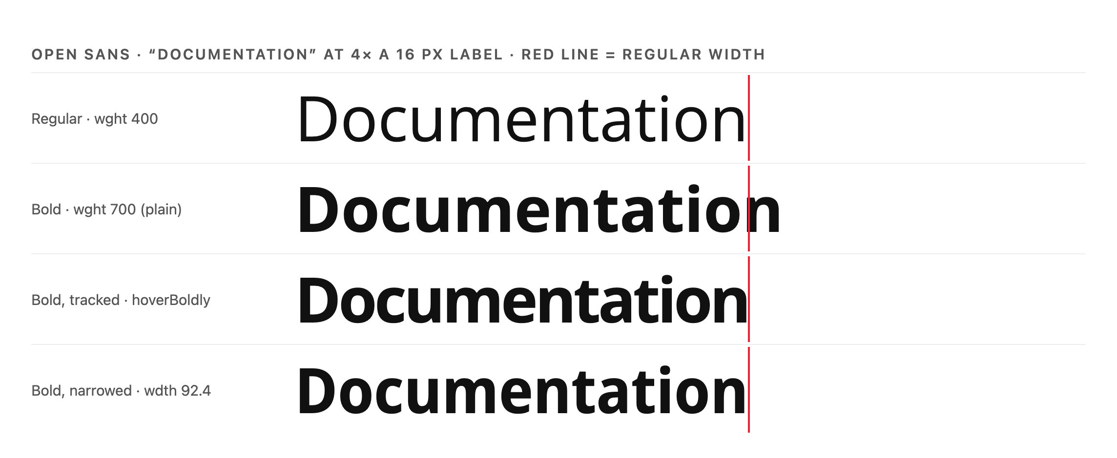
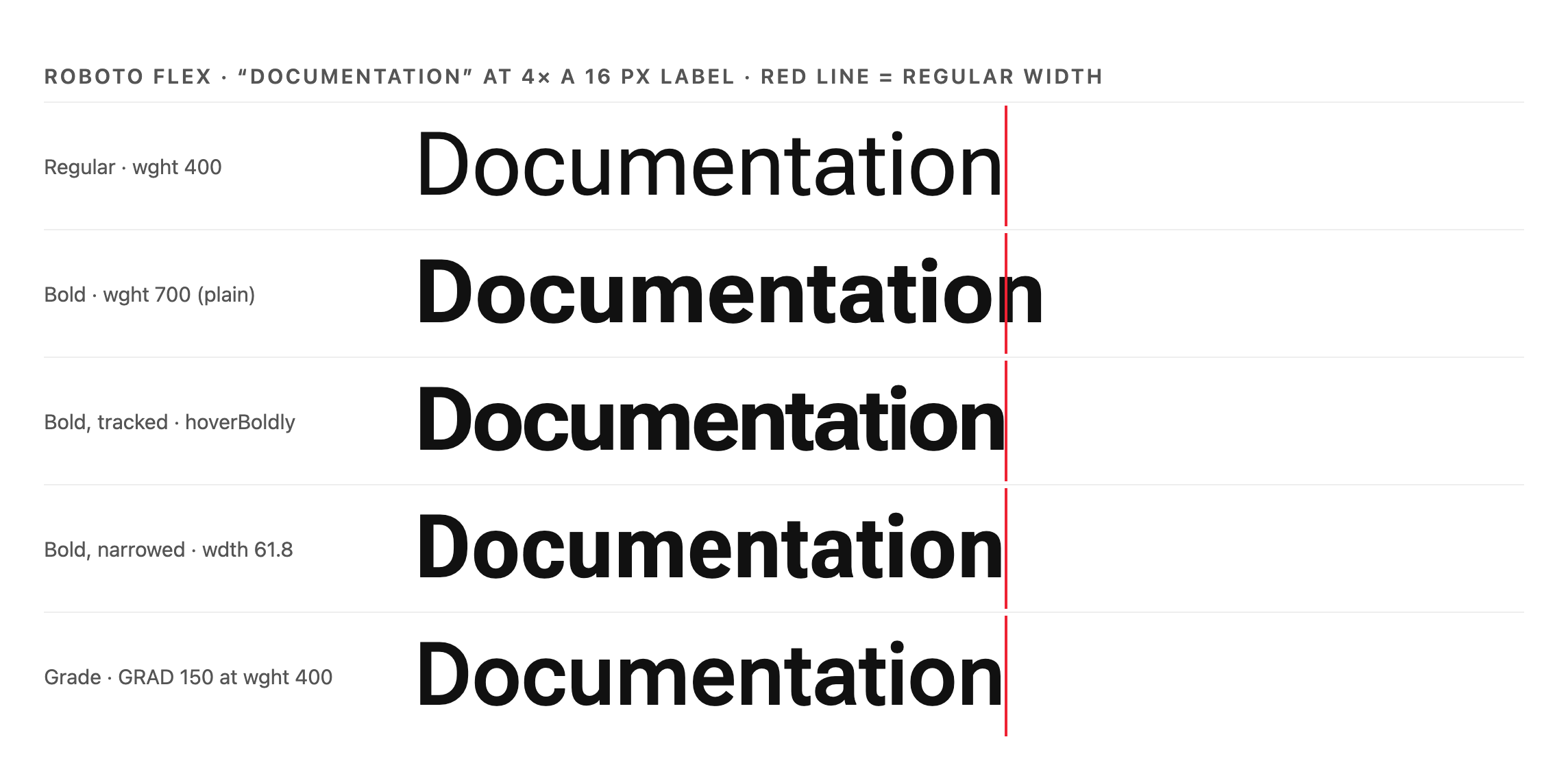
Rendered in Chromium with the real fonts, at 4× a 16 px label so details are visible. All four width-holding methods land on the red line. Tracked bold, which is what hoverBoldly does, holds the width but is visibly tight (look at "ti" and "ta"). Narrowed bold keeps natural spacing. Grade looks the most natural. This is our judgement from the renders, not a perceptual study.
Measured compensation
For a font with neither grade nor width, the extra width can be measured and removed. hoverBoldly measures the text at both weights with canvas measureText, off the page. It divides the extra width by the number of characters and adds that, as negative letter-spacing, on top of any letter-spacing the author has set, at the same moment the weight increases. It is built for text in a paragraph, where the hidden-copy trick can't reserve space.
Does it hold?
We ran the shipped library (element mode, no transition) in Playwright's Chromium 149 on six of the families above, eight labels each (including "Office" and "Profile", which contain ligatures), mixed case and in tracked uppercase (letter-spacing: 0.1em).
| Plain bold | hoverBoldly before the fix | hoverBoldly after the fix | |
|---|---|---|---|
| Mixed case: width change | median 3.5 px, max 8.9 px | median 0, max 2.1 px | median 0, max 0.02 px |
| Tracked uppercase: width change | median 2.5 px, max 7.6 px | median 12.4 px, max 23.3 px | median 0, max 0.16 px |
The review of this talk found two bugs, both now fixed. The library replaced the author's letter-spacing instead of adding to it, so tracked uppercase labels collapsed on hover, which was worse than plain bold. And it measured bold with ligatures intact, although any letter-spacing turns optional ligatures off, which left a residual on words like "Office". It now keeps authored tracking, measures with text-transform and italics, and measures the bold state with ligatures broken.
The zero result is expected by construction: the method measures the extra width and removes it. The table checks that the code does what the method says.
The compensation applied ranged from −0.0004 em to −0.048 em (median −0.031 em).
Does it count toward CLS?
Cumulative Layout Shift excludes shifts within 500 ms of user input (web.dev), but the Layout Instability explainer says "Events caused by pointer movement or scrolling do not count as 'input' for the purpose of the recent input exclusion" (WICG explainer). In Chromium, sweeping a pointer across a six-item menu produced 4–8 layout-shift entries in five of six fonts with plain bold, and none with hoverBoldly. The values were small (one hovered link scored 0.00026; "good" CLS is under 0.1). Keyboard focus counts as input and is excluded. The cost people notice is the visible jump.
Limits
- It needs a variable font with a weight axis.
- Tracked bold is visibly tighter than real bold; use grade or width when the font has them.
- Keyboard focus is handled in element mode only; keep a visible focus indicator (WCAG 2.4.7).
- Characters are counted as Unicode code points, so combining accents count separately.
- Measure after web fonts load. The React hook re-applies after
document.fonts.ready. - How it interacts with user text-spacing overrides (WCAG 1.4.12) is untested.
- The cursor-proximity mode fixes line breaks while it runs.
- Only Chromium was tested.
Objections, answered
| Objection | Answer |
|---|---|
| "Use a colour change instead" | Often the right call. When a design uses weight for emphasis, keep the width. |
| "The CSS hidden-copy trick works" | For nav labels, yes, and it is often the simpler choice. It reserves space at rest and doesn't suit words in running text. |
| "Why add JavaScript?" | Use grade, width, the CSS trick or font choice where they fit. For a fixed font and size, per-label offsets can also be computed at build time and shipped as CSS. |
| "Bold on hover is a bad pattern anyway" | Sometimes. Colour, underline and background are good signals, and many design systems use them. When a design does use weight, keep the width. |
| "Just use a uniwidth family" | A real option when you can choose the font: Recursive is free, and FF Balance is one commercial example. Most sites can't change their brand font. |
| "It's only a few pixels" | 2–9 px per label, on every hover, on every menu. |
Recommendations
- Type designers: ship a grade axis in web families, with a range that reads as emphasis. A width axis is the next-best thing.
- Designers: spec interaction states as "weight may change; width may not", and check the font's axes before choosing bold over colour.
- Developers: grade first, then the width axis, then measured spacing; for nav labels, consider the CSS hidden-copy trick. Keep a visible focus indicator.
- Standards: two open csswg-drafts issues touch this. #14523 (opened 24 September 2026) asks whether synthetic bold should change glyph advances. #14477 (opened 11 September 2026) proposes a
prefers-bold-textmedia feature; the working group's minutes note that the "grade axis can be changed, which thickens glyphs without making them wider". The same problem shows up in accessibility settings: when Chrome on Android honours the system bold-text setting it adds 300 to the weight, so "a font with weight 400 would become weight 700" (blink-dev, 2023), with the same widening. A related, broader request would let authors ask for emphasis that preserves advance widths, using grade or width where the font has them. As a sketch only, not a proposal:font-weight: 700; font-emphasis-advance: preserve;.
Open questions
- How do readers perceive tracked, narrowed and graded bold at real sizes (12–16 px), in Latin and other scripts? We compared renders, not readers.
- How large a grade range reads as "bold"?
- Do Firefox and Safari measure and render the same way?
Method
Width benchmark. 15 variable families from google/fonts at commit 9710da1 (4 October 2026). Python 3.10, fontTools 4.63.0, uharfbuzz 0.56.1 (HarfBuzz 14.4.0). Strings shaped at 16 px with default features; weight set to 400 and 700, other axes at defaults, opsz pinned to 16. A fontTools instancer cross-check agreed within 0.4 percentage points.
Census. Every family's axes from the Google Fonts catalogue metadata endpoint, 5 October 2026.
Width-axis experiment. For Roboto, Open Sans, Noto Sans and Roboto Flex, a bisection on wdth at weight 700 until the HarfBuzz width matched weight 400 (opsz 16 where present).
Renders. Chromium via Playwright, real font files, 64 px with opsz pinned to 16, letter-spacing from hoverBoldly's formula, wdth from the experiment; widths read back with getBoundingClientRect.
Fix test. The built library (dist/index.js, element mode, weight 400 → 700, no transition) in Playwright's Chromium 149 (build 149.0.7827.55), before and after the fixes; widths at rest and bold from getBoundingClientRect; a pointer swept across each menu in 6 px steps with a layout-shift observer.
Prior art. Every quoted source was opened on 4–5 October 2026.
Sources
- Stack Overflow, Inline elements shifting when made bold on hover, 2009 · Bolding some text without changing its container's size, 2011
- Typophile archive, 2016 reconstruction (06b/typophile.github.io; 2022 rebuild at typophile/typophile.github.io): "Normal/bold difference in width" (2004), "FontBureau Grades" (2005), "Consistent width across weights" (2011), "Different weights with equal width" (2012), "Hagmann Goes Uniwidth" (2013)
- Arrow Type, Recursive README
- Chris Coyier, Bold on Hover… Without the Layout Shift, CSS-Tricks, 2020
- Google Fonts Knowledge, Grade · Google Fonts docs, Grade · catalogue metadata
- MDN, Variable fonts guide
- web.dev, Cumulative Layout Shift · WICG, Layout Instability explainer
- W3C csswg-drafts, #14523: synthetic-bold vs glyph advances · #14477: prefers-bold-text
- Microsoft Fluent UI, TabList.types.ts · GitHub Primer, UnderlineTabbedInterface.module.css
- Google Fonts Knowledge, Grade axis (GRAD) · Material Design 3, Applying icons
- blink-dev, Intent to Ship: Honoring Android OS-Level Bold Text Settings, 2023
- W3C, Understanding SC 2.4.7 Focus Visible
- hoverBoldly · GitHub (the authors' tool) · our measurements